Eric J Ma's Website
written by Eric J. Ma on 2017-02-06
Sometimes, all that you need is a visual cue on whether the data you have on hand are complete or not. Looking at a table can be dizzying at times, so I'm very glad I found this packaged called missingno! It provides a way to quickly visualize the "nullity" of your dataset. See an example below:
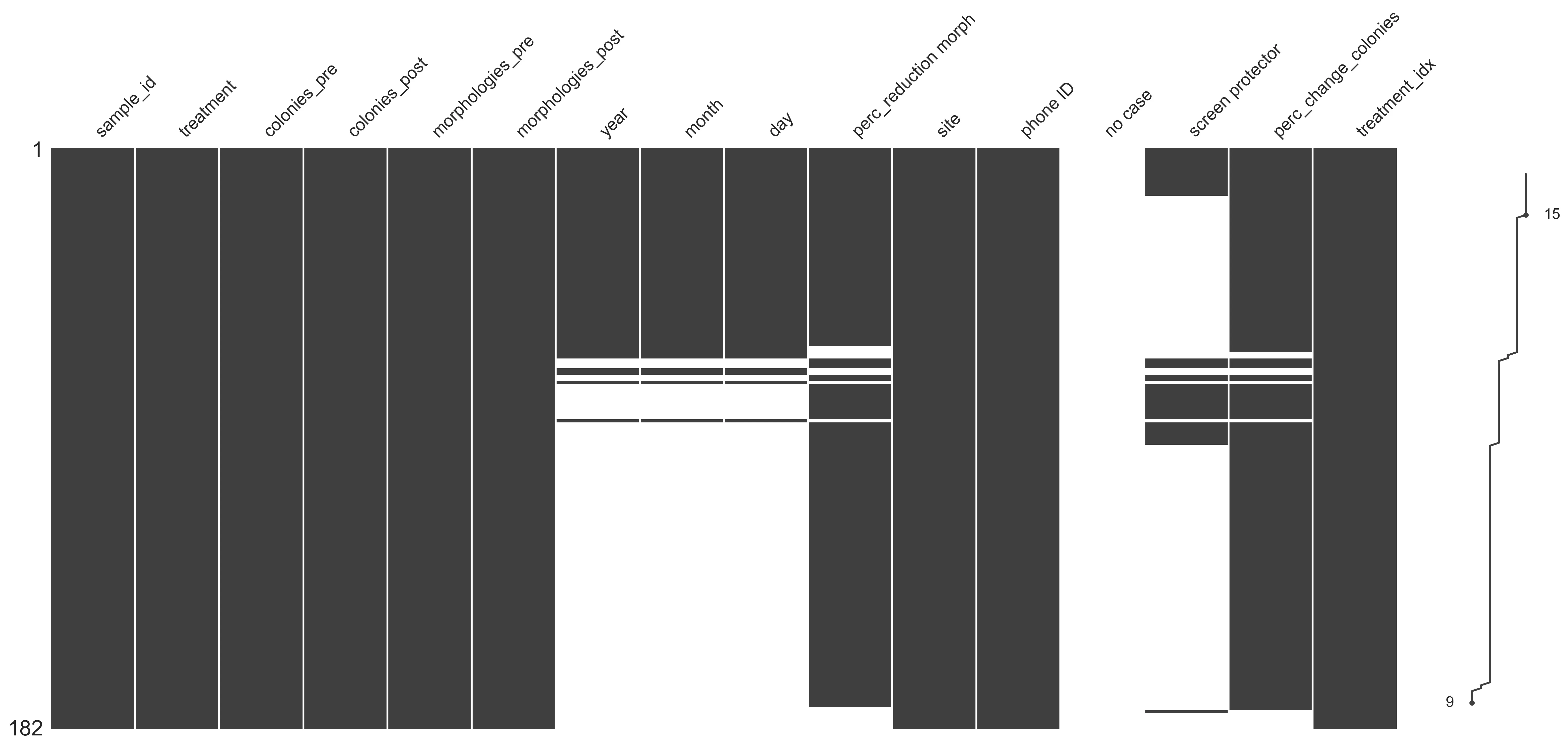
It's built on top of matplotlib, and takes in pandas DataFrames, which means it plays very nicely with the rest of the PyData stack. I recently took it for a tour when I did a quick stats consult with Mia Lieberman (DCM); the above plot was made using her data, used with permission.
Highly recommended package!
Cite this blog post:
@article{
    ericmjl-2017-data-diagnostics-missingno,
    author = {Eric J. Ma},
    title = {Data Diagnostics: missingno},
    year = {2017},
    month = {02},
    day = {06},
    howpublished = {\url{https://ericmjl.github.io}},
    journal = {Eric J. Ma's Blog},
    url = {https://ericmjl.github.io/blog/2017/2/6/data-diagnostics-missingno},
}
I send out a newsletter with tips and tools for data scientists. Come check it out at Substack.
# TODO(eric): learn how to learn anything. feb 2027.
If you would like to sponsor the coffee that goes into making my posts, please consider GitHub Sponsors!