High Level API
In this notebook, we will walk through the high level nxviz API.
The intent here is to provide a convenient (albeit restrictive) way to build graph visualizations for exploratory analysis purposes. Our goal is to help you declaratively visualize a network using one of the rational visualizations provided. The design is intentionally quite restrictive; customizations are limited to what you can compose together.
You should treat these the way you would use the plotting package seaborn:
to get you a quick overview of your data
without being bogged down by the details of how things are placed on the screen.
If you want finer-grained control,
then you may wish to drop down to the mid-level or low-level API instead.
How to read this notebook
Treat this notebook as a gallery of examples. As with all declarative APIs, it's important to know the structure of the graph. We're showing you the exact source code for graph construction, and the graph's corresponding node and edge tables, to make things easier to read.
%config InlineBackend.figure_format = 'retina'
%load_ext autoreload
%autoreload 2
from random import choice

import matplotlib.pyplot as plt
import networkx as nx
import numpy as np

import nxviz as nv
from nxviz import annotate, highlights
from nxviz.plots import despine, rescale, respine
Example Graph
We're going to use an example graph, the erdos-renyi graph, to illustrate.
Source code
Here's the source code for graph generation.
G = nx.erdos_renyi_graph(n=71, p=0.1)
for n, d in G.nodes(data=True):
    G.nodes[n]["group"] = choice(["a", "b", "c"])
    G.nodes[n]["value"] = np.random.exponential()

np.random.seed(44)
for u, v, d in G.edges(data=True):
    G.edges[u, v]["edge_value"] = np.random.exponential()

from random import choice

u, v = choice(list(G.edges()))
Node table
from nxviz.utils import edge_table, node_table

node_table(G)
edge_table(G)
Hive Plot
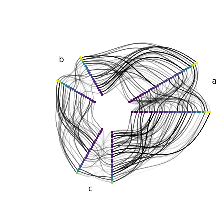
Here's a Hive Plot view of the graph.
The Hive plot is appropriate here, because we have one categorical variables with three values by which we can group our nodes.
Here's one example where we group the nodes by their group attribute,
sort and colour them by their value attribute,
and set the transparency of an aged based on the edge's edge_value attribute.
We also annotate the grouping on the hive plot.
ax = nv.hive(
    G,
    group_by="group",
    sort_by="value",
    node_color_by="value",
    edge_alpha_by="edge_value",
)
annotate.hive_group(G, group_by="group", offset=np.pi / 12)
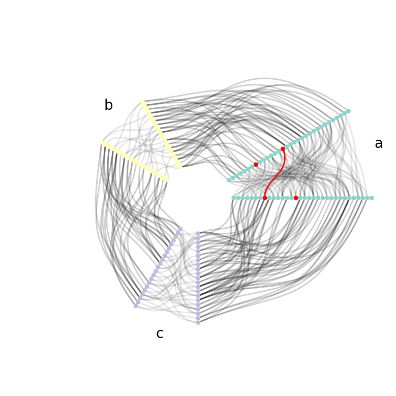
Here's an alternative visualization where
we group and colour the nodes by their group attribute,
ignoring the value attribute on the nodes
and the edge_value attribute on the edges.
ax = nv.hive(G, group_by="group", node_color_by="group")
annotate.hive_group(G, group_by="group")
highlights.hive_node(G, u, group_by="group")
highlights.hive_node(G, v, group_by="group")
highlights.hive_edge(G, u, v, group_by="group")
The same consistent API applies to the other plot types.
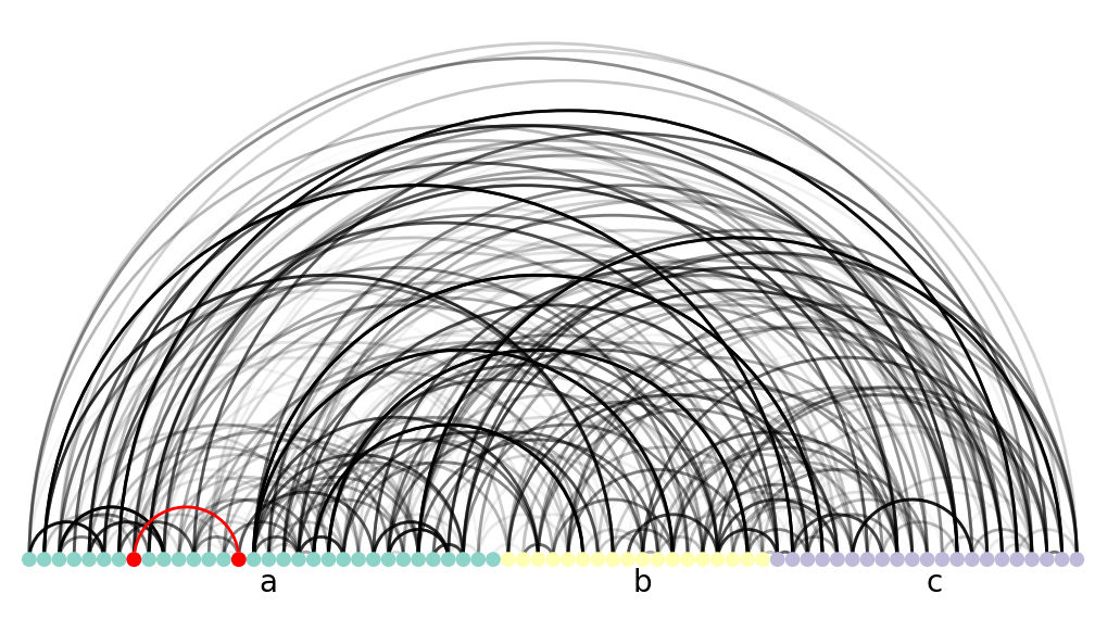
Arc Plot
ax = nv.arc(
    G, group_by="group", node_color_by="group", edge_alpha_by="edge_value"
)
annotate.arc_group(G, group_by="group", ha="center", rotation=0)
highlights.arc_node(G, u, group_by="group")
highlights.arc_node(G, v, group_by="group")
highlights.arc_edge(G, source=u, target=v, group_by="group")
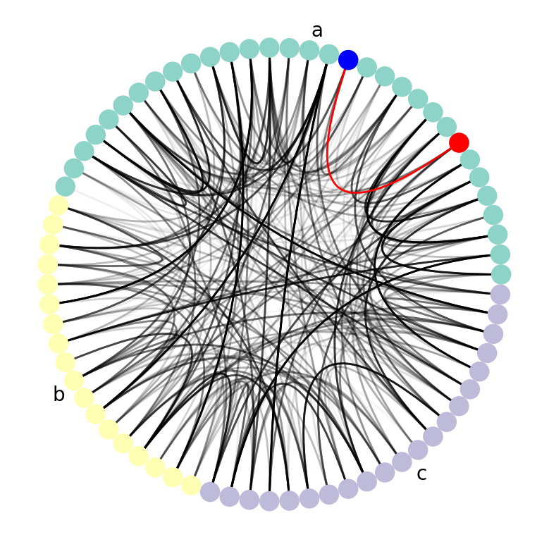
Circos Plot
ax = nv.circos(
    G, group_by="group", node_color_by="group", edge_alpha_by="edge_value"
)
annotate.circos_group(G, group_by="group")

highlights.circos_edge(G, u, v, group_by="group")
highlights.circos_node(G, u, group_by="group")
highlights.circos_node(G, v, group_by="group", color="blue")
Matrix Plot
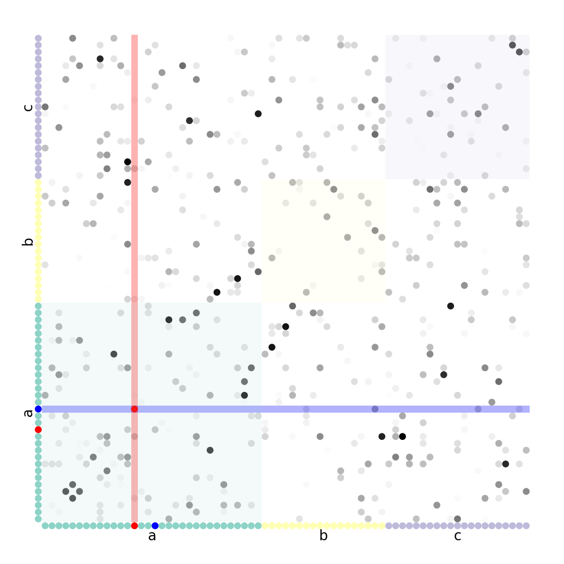
fig, ax = plt.subplots(figsize=(7, 7))
ax = nv.matrix(
    G,
    group_by="group",
    sort_by="value",
    node_color_by="group",
    edge_alpha_by="edge_value",
)
annotate.matrix_group(G, group_by="group")
annotate.matrix_block(G, group_by="group", color_by="group", alpha=0.1)
highlights.matrix_node(G, u, group_by="group", sort_by="value")
highlights.matrix_node(G, v, group_by="group", sort_by="value", color="blue")
highlights.matrix_row(G, u, group_by="group", sort_by="value")
highlights.matrix_row(G, v, group_by="group", sort_by="value", axis="y", color="blue")

highlights.matrix_edge(G, u, v, group_by="group", sort_by="value")
